Google Unveils First Logo Refresh in Nearly a Decade: What’s New and Why It Matters
Intro: Google’s Logo Gets a Fresh Look After Almost a Decade
In a move that has tech enthusiasts buzzing, Google has quietly rolled out a major update to its logo — the first significant change in nearly 10 years. This transformation goes beyond aesthetics; it’s a signal of Google’s evolving design philosophy and a step forward in unifying the user experience across its vast product ecosystem and is one of the major Google tech news.
Why the Update?
The last major redesign of Google’s logo happened in 2015, when the company moved from a serif typeface to a more playful, sans-serif design. That version represented the company’s transition into a mobile-first world. Now in 2025, the landscape has shifted again — driven by AI, minimalism, and adaptive interfaces.
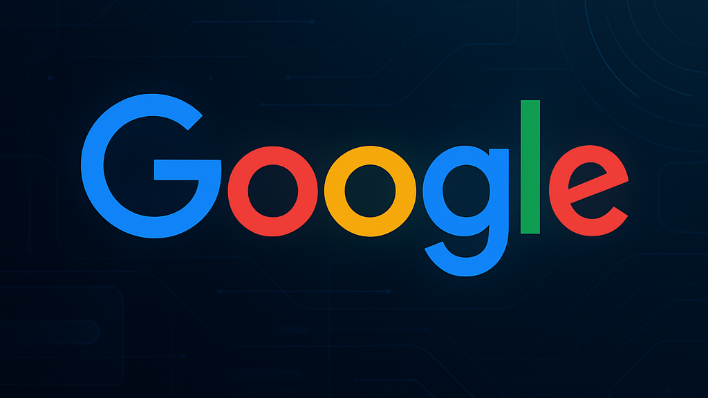
Google’s new logo embraces Material Design 3, which emphasizes personalization, fluid motion, and soft geometry. The refresh doesn’t drastically change the iconic colors, but you’ll notice a more refined weight, better scalability across devices, and a consistent alignment with Google’s modern UI components.
Key Design Changes:
- Subtle Typography Adjustments: The letters remain friendly and familiar, but they now have slightly tweaked curves and kerning to improve clarity at smaller sizes and high-resolution screens.
- Refined Color Palette: The signature Google blue, red, yellow, and green have been subtly deepened to reflect accessibility improvements and contrast consistency.
- Material Design 3 Principles: Rounded edges, depth elements, and adaptive tones help the logo fit naturally across web and mobile platforms.
- Adaptive Layout Integration: Google has tailored the logo to look consistent in both light and dark modes, ensuring brand integrity across Android, Chrome, Gmail, and other platforms.
More Than Just a Logo
This redesign is part of a broader Google initiative aimed at harmonizing the user experience across its suite of applications. From Gmail to Google Maps, each service is seeing subtle visual updates designed to improve usability, consistency, and accessibility.
It’s also worth noting that this change aligns with Google’s push into AI-powered services like Gemini and Bard, where visual consistency and identity are crucial. A unified, clean, and responsive design system allows faster feature rollouts without sacrificing user familiarity. There will be more tech news for Google tech news.
Industry Response
Designers and tech experts have largely welcomed the change, citing it as a natural evolution rather than a radical shift. It echoes Apple’s minimalist approach while still maintaining Google’s playful brand personality.
Final Thoughts
While it might look like just a few minor tweaks to the untrained eye, the 2025 Google logo update is a significant milestone in the company’s design journey.
It reflects not only where Google is today but also where it’s headed — into a future defined by AI, seamless design, and intuitive user experiences.
Keep an eye out for how this new visual identity continues to unfold across Google’s ecosystem and more Google tech news.
Read more🌐 about latest Tech updates on out Technology and Learning labs Category Section
Also read our previous article on Google Firebase Studio
#GoogleLogo #TechUpdate #MaterialDesign3 #GoogleNews #Google2025 #TechDesign #UIUX #BrandRefresh #GoogleAI #DesignTrends